milsons point 2
–
awards / 2005 interior design awards finalist
project team / andy harding, binghi lamerton
builder / paul king pty ltd
joiner / vrd detailed joinery
photographer / paul gosney
We accepted a commission to transform a poorly planned apartment in a former multi-storey office building in Milsons Point. Our clients work locally and required this space to serve as their weekday home given that they spent extended weekends at their main house in Noosa.
The existing condition denied them a connection to the view and light by stacking bedrooms along most of the perimeter. The kitchen was also effectively disconnected from its dining area and the narrow living space by being tucked into the rear of the space.
Our approach was to rationalize bad planning by totally reconfiguring the space. We do this by stripping out everything and taking the apartment back to a bare shell. Re-planning then occurs to allow for a considered entry sequence, connection to sky, light and view whilst providing reasonable, legible separation of public and private spaces.
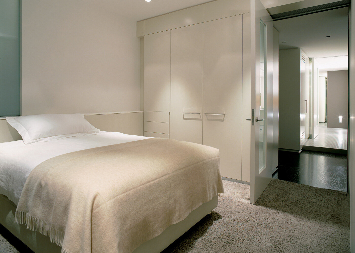
In this case, one of the three bedrooms was relocated into the back of the apartment to where the kitchen had been. This allowed for the two remaining bedrooms to be increased in size and better connect to the light and the view. The public spaces then increased in size along the perimeter window wall thereby better connecting to view, light and offering an increase in general amenity. The third bedroom became a guest/study space raised above the main floor level and defined by a different floor finish. The ability to redistribute this function was the key to making a meaningful difference to the space.
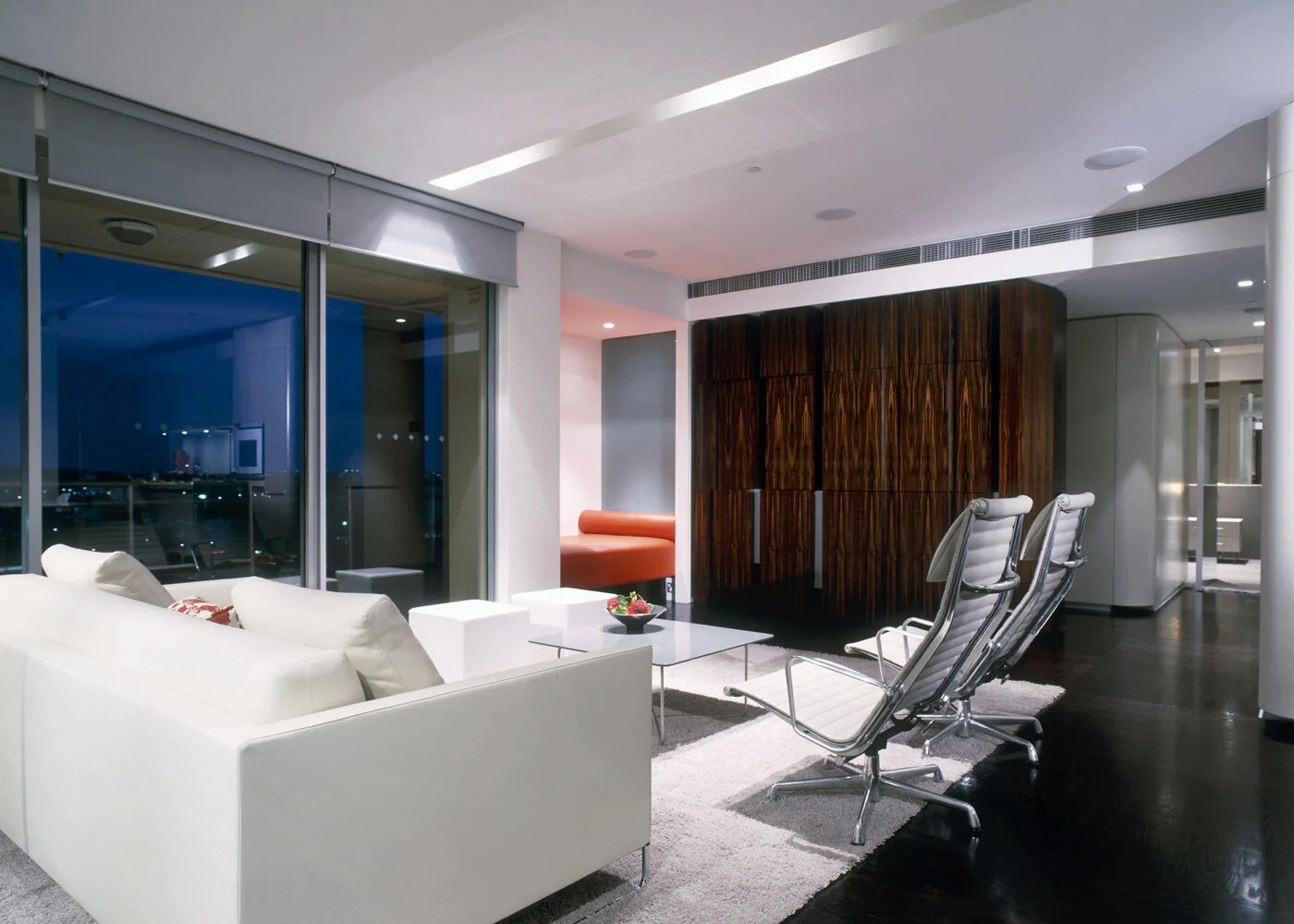
The kitchen/dining space was brought into the main living/entry zone to clearly define public areas from private. The main wall was clad in full height mirror panels that at once doubled the perception of available space and reflected the Harbour view into the body of the apartment. The kitchen now afforded views that would have been impossible previously. A chocolate timber floor, laid in an opposing 900mm x 900mm grid, defined the main spaces, while a very plush shag pile carpet defined the lounging area and the bedroom spaces.
Joinery plays an important role in our transformations, sometimes highlighting edges and other times defining spaces. The main kitchen joinery for example is a rectangular pod that divides the kitchen and guestroom/study. It houses the main kitchen bench and associated storage on one side, general storage at each end and the study on the other side. A built-in dining table reflects the apartment's use, as it was not conceived as a place for extensive entertaining more as a home for the working week.
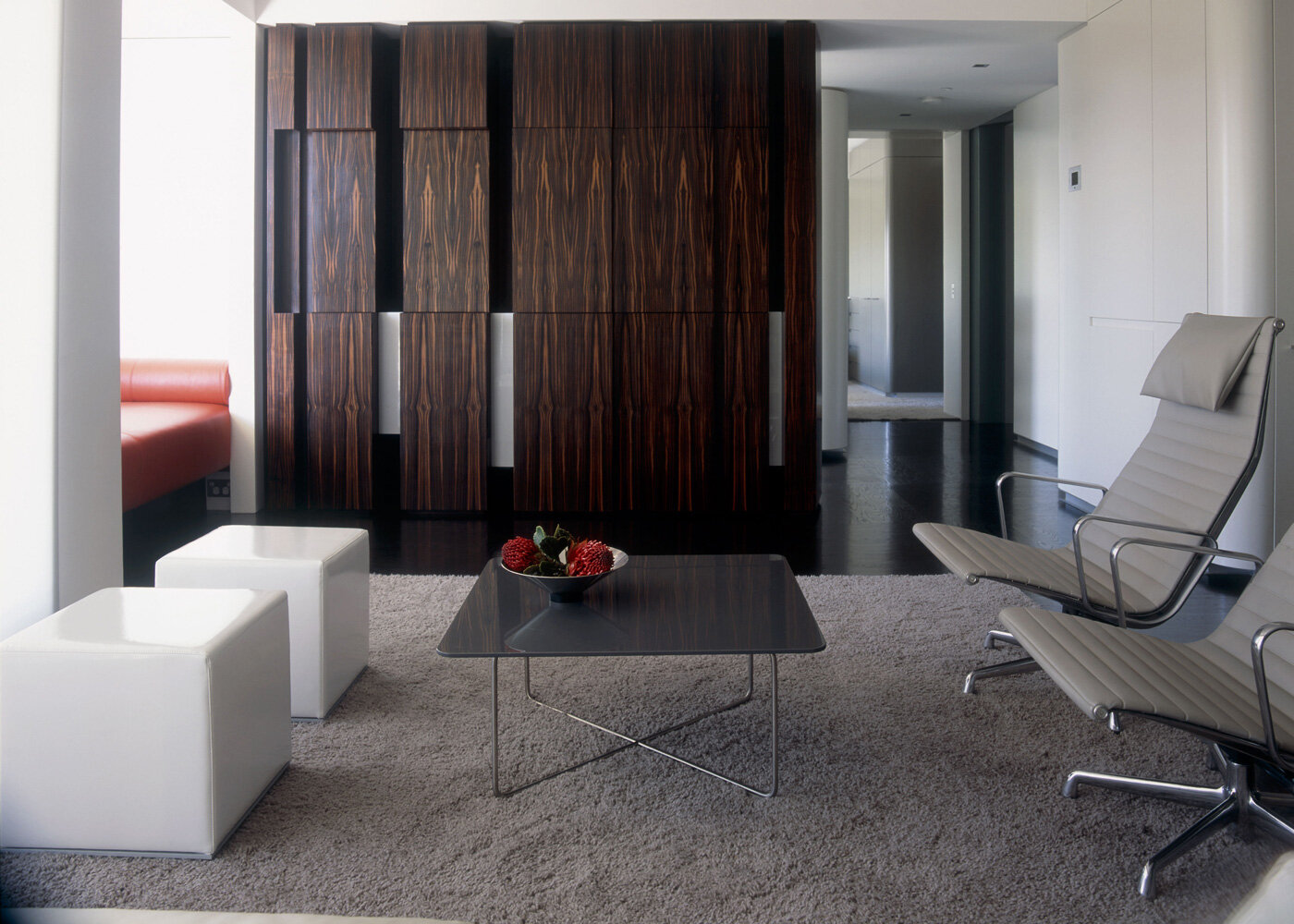
A dark timber veneer wall unit forms the edge of the living space and presents as a series of solid engaged columns that house audiovisual equipment, cds, dvds, etc. A sliding screen that forms part of the unit's composition when closed hides the plasma screen.
This project forms part of a series of apartments that have been enormously improved via a determined design strategy that requires total replanning and rebuilding.


