mcmahons point
–
project team / andrew stanic, mona lundborg, binghi lamerton, natasha mccoy, hugo harpley
builder / prime form construction pty ltd
landscape architect / spirit level designs
joiner / mark watson design
structural engineer / partridge partners
photography / paul gosney
I was asked to alter this quite small free standing house in McMahon's Point so it could accommodate a small family of three which has now grown to four. The house was unremarkable and typically had no strategy relative to providing connection to the limited outdoor space available to it. The entry was poorly defined and a carport attached to its base compromised the connection to the street.
The house is a Californian bungalow located in a conservation zone under North Sydney Councils’ control and I wanted to make changes that involved inserting a legible contemporary addition into the roof plane. To achieve this end we worked in close collaboration with a respected heritage consultant who vetted the crazier options (one of them called the claw) and supported the final version. The idea was to use the accepted method of insertion and addition via contrast to its full effect. We wanted the new element to take the optimum shape relative to sightlines and height controls and let it open to the northern sky where it needed to. The asymmetrical addition was designed to balance and complement the existing silhouette.
Initial discussions determined that the new object should be set back from the front of the existing house thereby reinforcing a positive streetscape connection. Its somewhat free form determined a material choice of zinc which also gave us the advantage of it having a recessive quality due to its colour. The concept developed into one that by definition wore two faces, one that presented a well mannered side to the street being recessive, setback and allowing the existing house to be clearly legible and thereby by reinforcing the conservation zone streetscape objective and the other that was designed to relate to the small rear yard and present an elevational treatment that was in a way an expression of the sectional view of the addition. So simply the new object itself changed character from front to back.
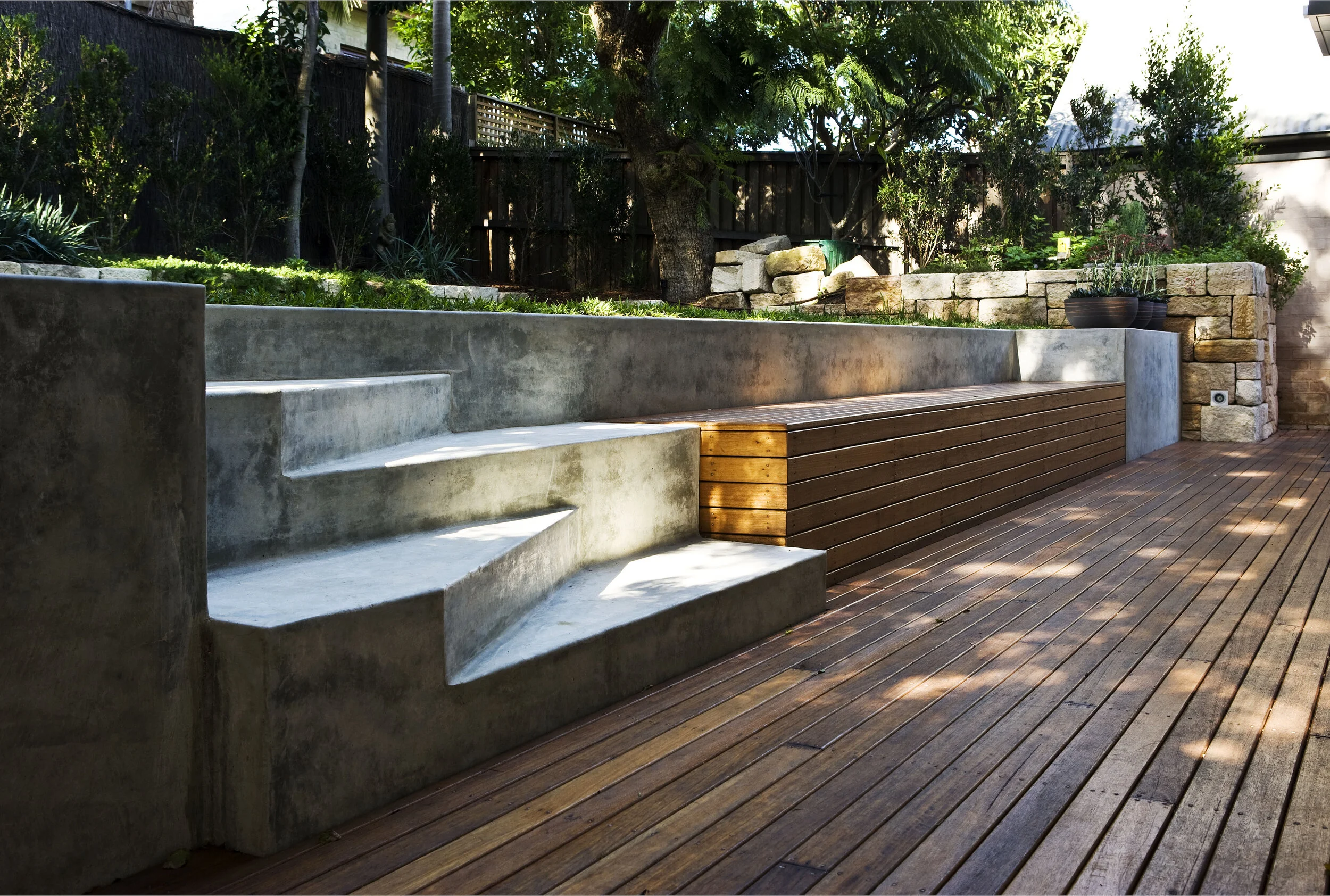
The rear yard is higher than the ground floor level and the low nature of the addition also meant that there is a stronger dialogue between the rear yard and this face, therefore the design and detail were carefully regarded.
The front of the house was expanded and the streetscape connection improved by a new half level deck and street wall treatment. An entry sequence was inserted that provided few clues as to the zinc element over and this was done to reduce the scale of the house when moving down the side passage to the garden. I like that it is only when you step up onto rear yard level that the extent of the new presents itself.
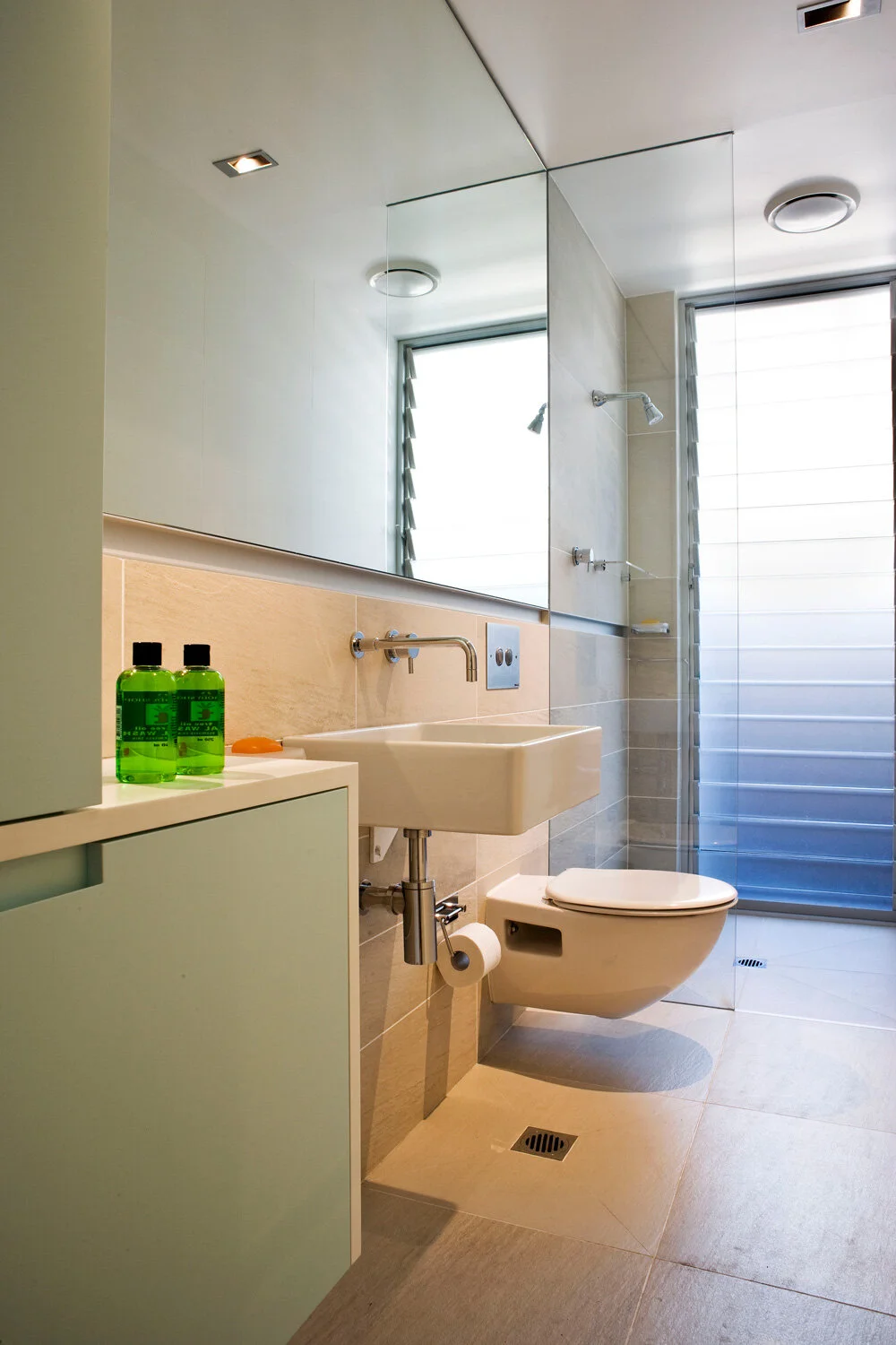
The interior spaces have been adjusted to improve function and allow for considered connection to new outdoor living areas. Existing elements of worth have been incorporated into the design scheme, the bay window being an example.
I like this project because it is modest yet effective, it resolves functional issues as well as making a strong architectural gesture that works within the context of a conservation zone. It is both well mannered and bold in its way and it reflects a collaborative approach that is now enjoyed by our clients.


